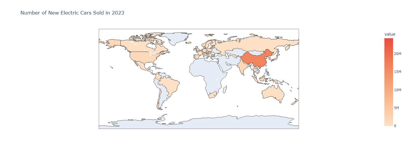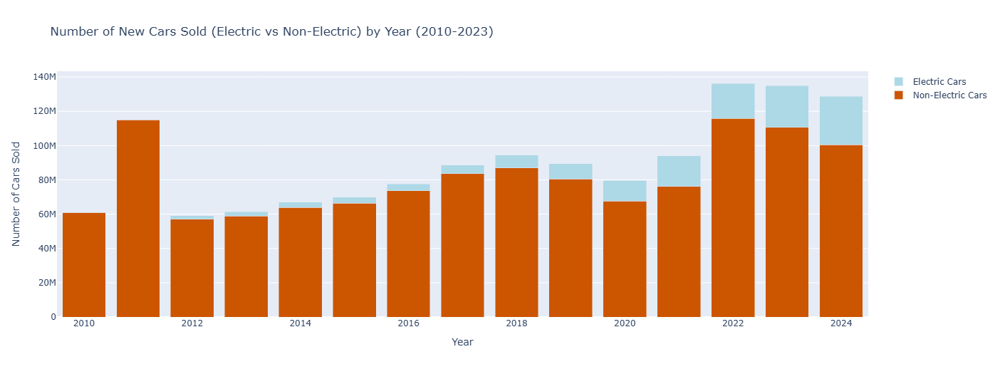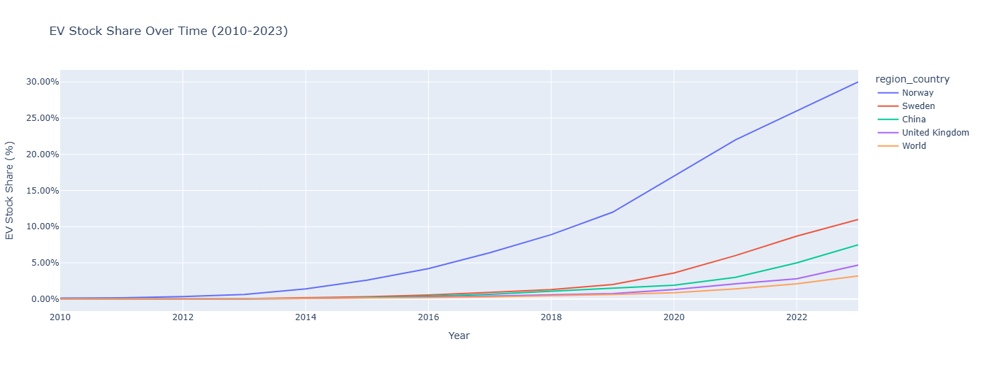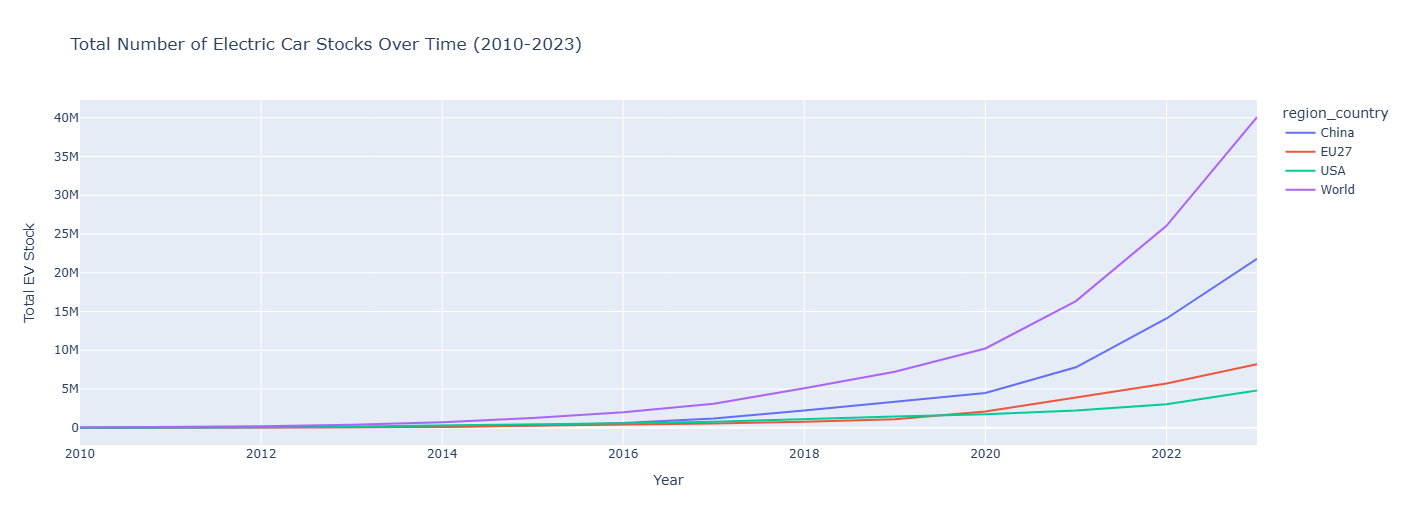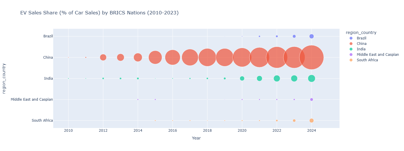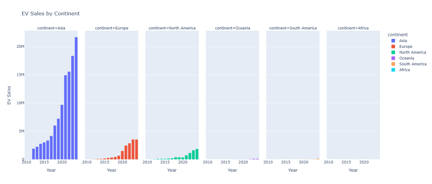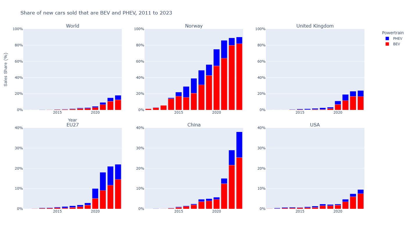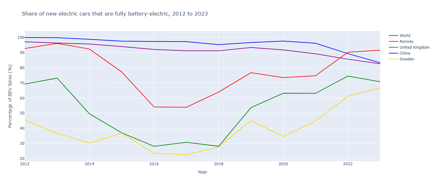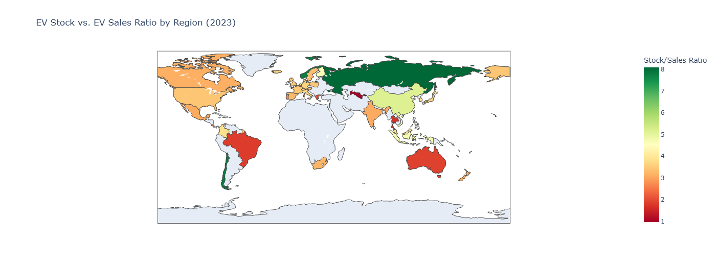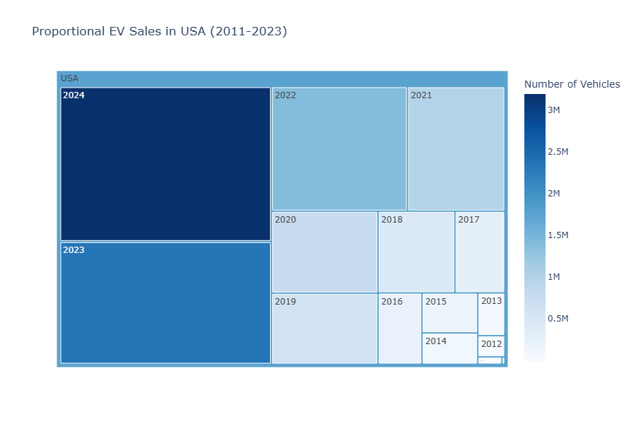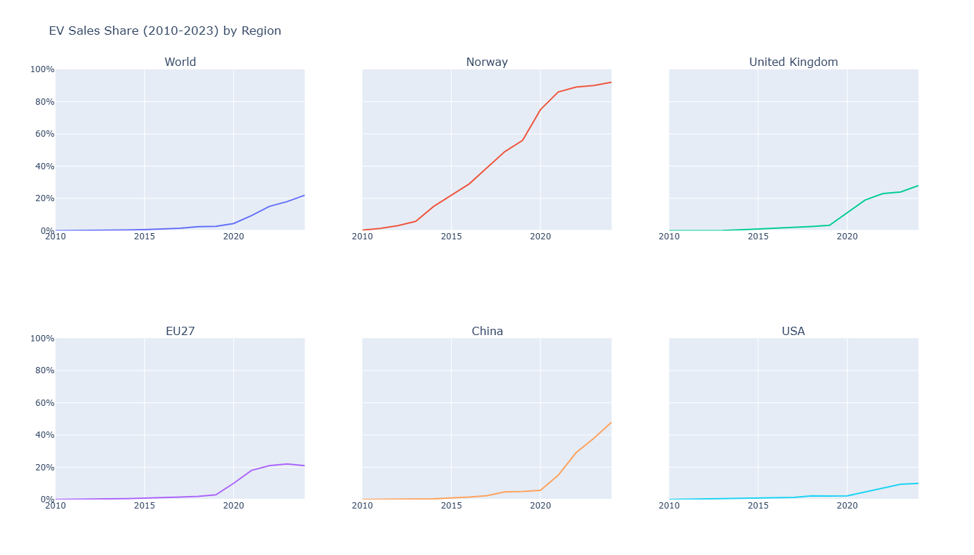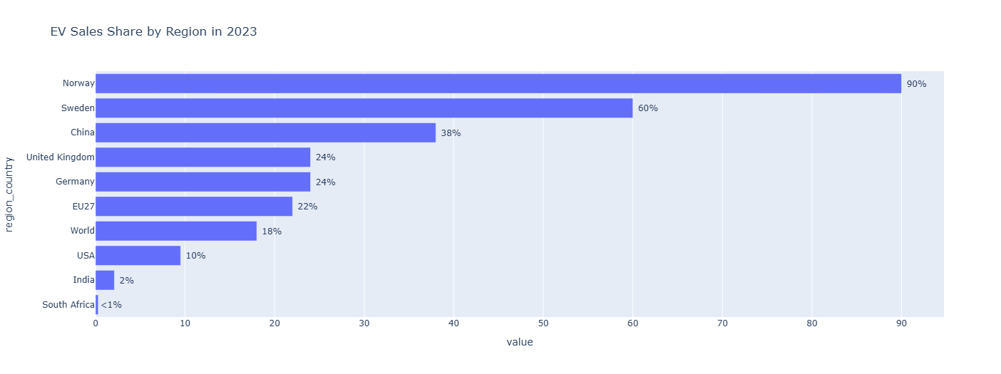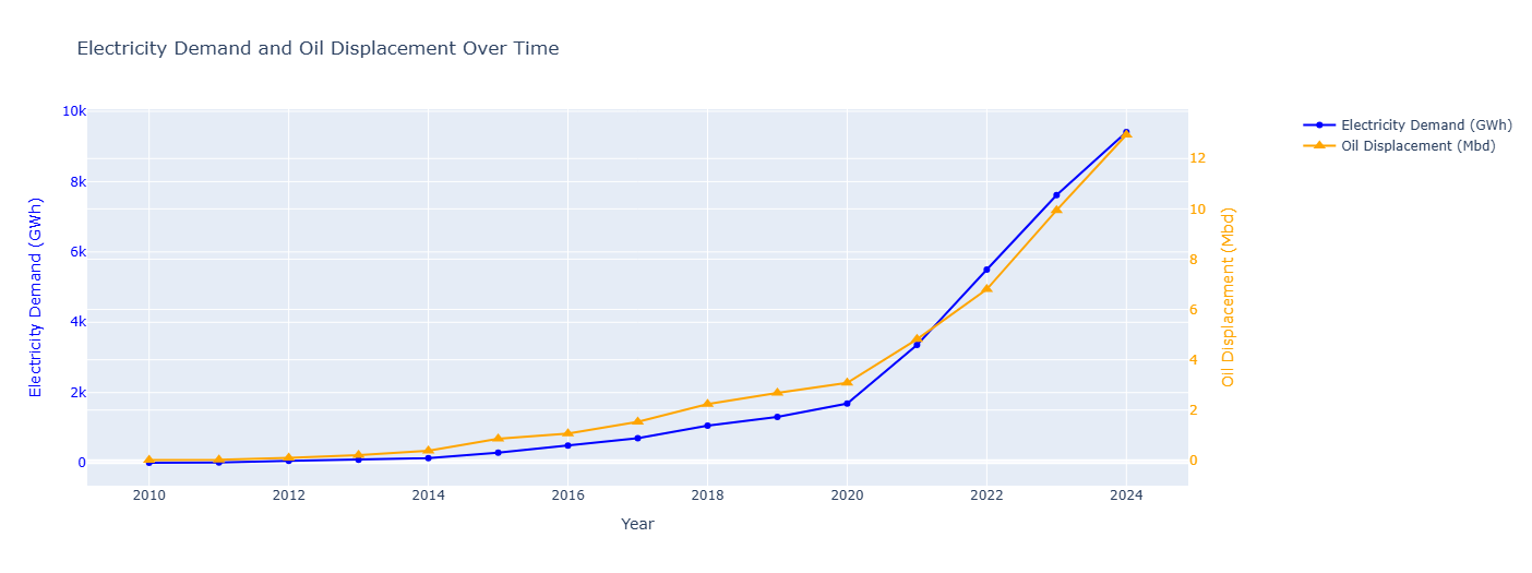
Scenario
Creating a series of interactive visualizations using python and the dash library using real electric vehicle data from the International Energy Agency.
Screenshots of the data below. Click the Scenario link above to load the google colab page where you can see the interactivity of the visualizations.