A PowerPoint presentation breaking down the data findings of mock hospital data regarding Pulmonary Embolism Diagnosis.
Software:
Presentation made in PowerPoint
Dashboards made in Tableau and Google Looker Studio
Analysis done using SQL and Python (Seaborne, Numpy)
Findings:
Major differences in hospital PE Diagnosis, especially on different days of the week
Differences not large enough to be considered statistically significant (Fails Chi-Square test)
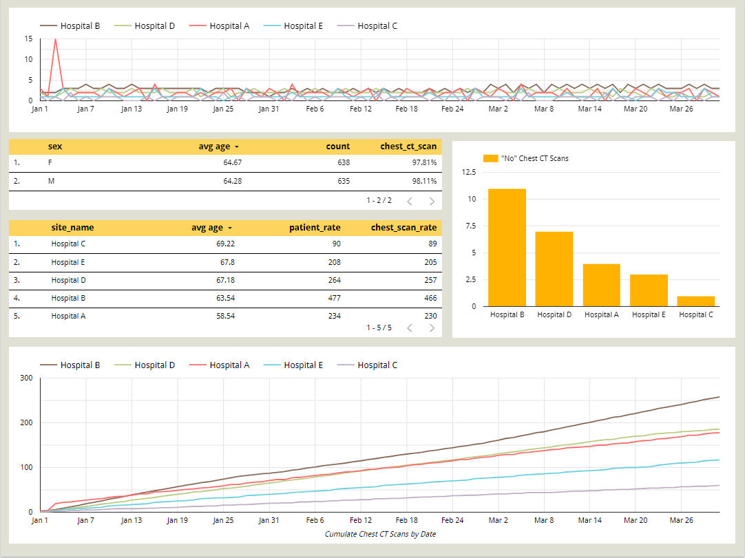
Featured in the presentation is this interactive Google Looker Studio dashboard.
Software: Looker Studio
Findings:
Hospital B diagnoses PE consistently at a higher rate throughout Q1 2022
Hospital C has a much smaller patient load than other hospitals
Hospital A has a much younger average age than other hospitals
Men and Women are being diagnosed at comparable rates